
"In the Weeds with Plant People" – Social Media Graphics Package
Role: Motion Graphics & Brand Designer
Project:In the Weeds with Plant People (Social Media Series)
Collaborator / Platform: Dotdash & The Spruce
Year: 2020
Title Animation
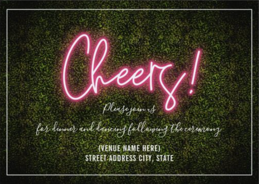
Mood Board & Inspiration



Thumbnail
-
I designed the comprehensive graphics and social media branding package for The Spruce’s digital series, In the Weeds with Plant People. Tailored specifically for vertical social feeds (9:16), the visual package was built to instantly grab the attention of millenial and Gen-Z plant enthusiasts. The design direction draws heavily from the trendy, atmospheric "living green walls" and vibrant neon signs popular in modern boutique plant shops and urban selfie spaces.
-
Botanical content on social media can easily blend together into a sea of static green images. The objective was to create a scroll-stopping digital identity that felt organic yet electric. The graphics package needed to look premium and cleanly branded under The Spruce, while leaning into a nightlife-meets-greenhouse aesthetic that felt natively social, energetic, and young.
-
Selfie-Wall Concept Development: Translated the physical aesthetic of a neon-lit plant wall into a digital template. I paired an energetic, buzzing neon pink glow with deep organic textures to establish a premium lifestyle mood.
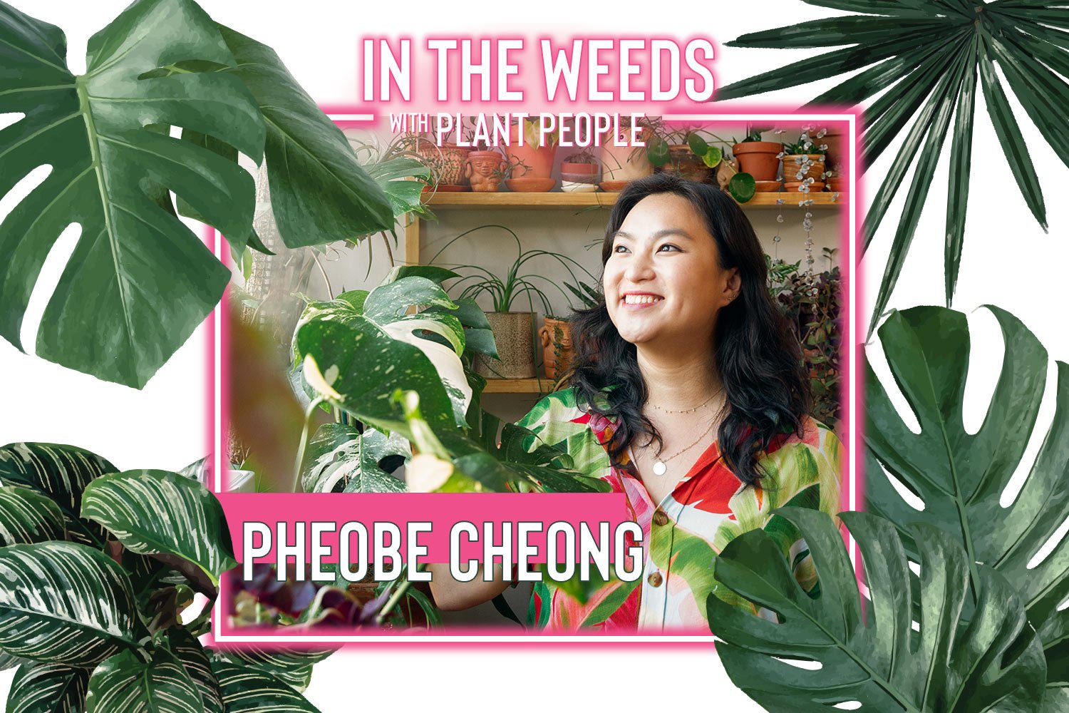
Dynamic Title Styling: Developed the custom text treatment for the main title card. By layering a bright neon pink emission effect onto the bold "IN THE WEEDS" typography and framing it with a clean geometric neon border, the graphics cleanly slice through noisy social media feeds.
Foliage Layering & Depth: Carefully masked and positioned high-fidelity tropical plant assets—including Monstera deliciosa, Calathea, and palm fronds. These leaves dynamically frame the edges of the screen, creating a layered three-dimensional depth that makes the viewer feel literally "in the weeds."
Social Asset Optimization: Structured the template to cleanly transition from the title sequence into video content, ensuring text overlays, lower thirds, and call-to-action cards remained highly legible without obstructing the primary video footage.
-
The final graphics package provided The Spruce with a highly punchy, cohesive identity for the launch of the series. By seamlessly marrying the soft, stylized pink neon glow with rich botanical illustrations, the visual framework successfully captured the aesthetic zeitgeist of the online plant community—driving elevated viewer retention and seamless brand recognition across platforms.