
"Once a Rebel, Always a Rebel" – Commemorative Design for Star Wars Celebration Japan
Role: Illustrator & Merchandise Designer
Project: Commemorative Fan Merchandise (Embroidered Patch & Sticker)
Event: Star Wars Celebration Japan
Year: 2025
Project Overview
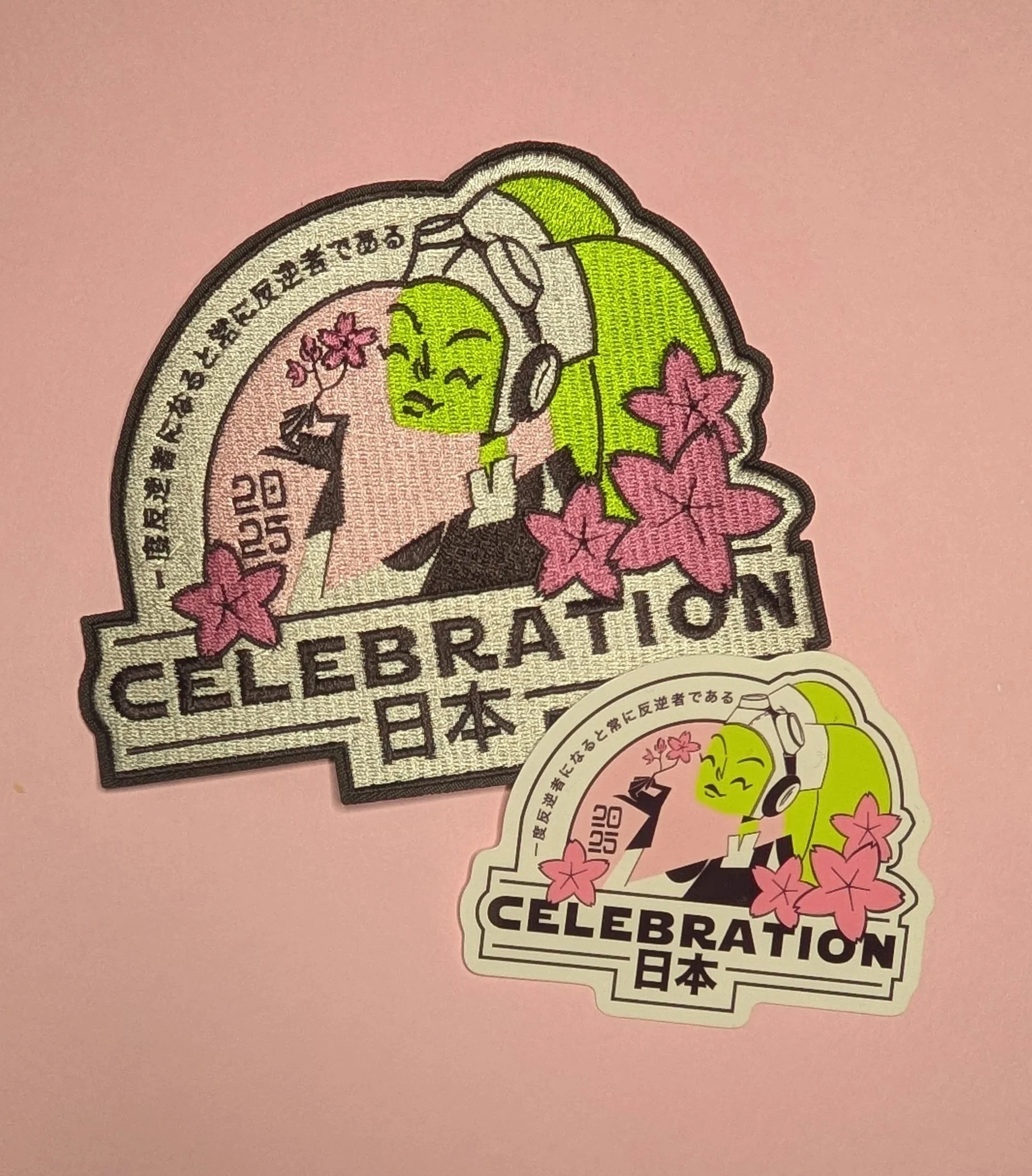
This project was a deeply personal passion piece designed for Star Wars Celebration Japan. It represents a convergence of two massive pillars of my life: my deep love for Star Wars Rebels—specifically its heart and captain, Hera Syndulla—and my profound connection to Japan, having lived there during my high school years. The goal was to create a piece of commemorative merchandise (brought to life as an embroidered patch and die-cut sticker) that honored both traditional Japanese motifs and the rich emotional lore of the Phoenix Squadron.

The Design & Core Concept
The challenge of this piece was to move beyond standard fan art and build layers of hidden meaning that would reward hardcore Star Wars fans while respecting Japanese design aesthetics.
Every visual element was chosen with intentionality:
The Japanese Typography: Flowing along the upper arch of the frame is the phrase 一度反逆者になると常に反逆者である ("Once a rebel, always a rebel"). This iconic franchise sentiment acts as the perfect thematic bridge, tying the rebellious spirit of the characters to the host country's language.
The Sakura (Cherry Blossoms): Sakura are a timeless symbol of Japan, representing the beautiful, fleeting nature of life. In this design, the total number of sakura blossoms intentionally aligns with the call signs of the Phoenix Squad numbers.
A Legacy in Her Hand: Nestled specifically in Hera's hand is a small cluster of three distinct blossoms. These carry the heaviest emotional weight of the piece, symbolizing her immediate family: herself, Kanan Jarrus, and their son, Jacen Syndulla.
Visual Execution
The artwork utilizes a striking, high-contrast palette. Hera’s signature vibrant green skin and flight cap contrast beautifully against the soft, pastel pinks of the background and the sakura petals.
The design was optimized to translate perfectly across two distinct physical mediums:
The Embroidered Patch: The clean, bold linework was structured specifically to accommodate tight embroidery threading, giving the final patch a rich tactile quality where the texturing of the sakura and Hera's lekku really pop.
The Die-Cut Sticker: A clean, matte vinyl translation that preserves the crisp graphic design and subtle color gradients of the original digital illustration.
The Result
The project stands as a beautiful full-circle moment for my portfolio. By infusing authentic Japanese cultural symbols with deeply researched character lore, the final pieces served as a poignant, beautiful tribute to a favorite character at an event hosted in a country that shaped who I am today.